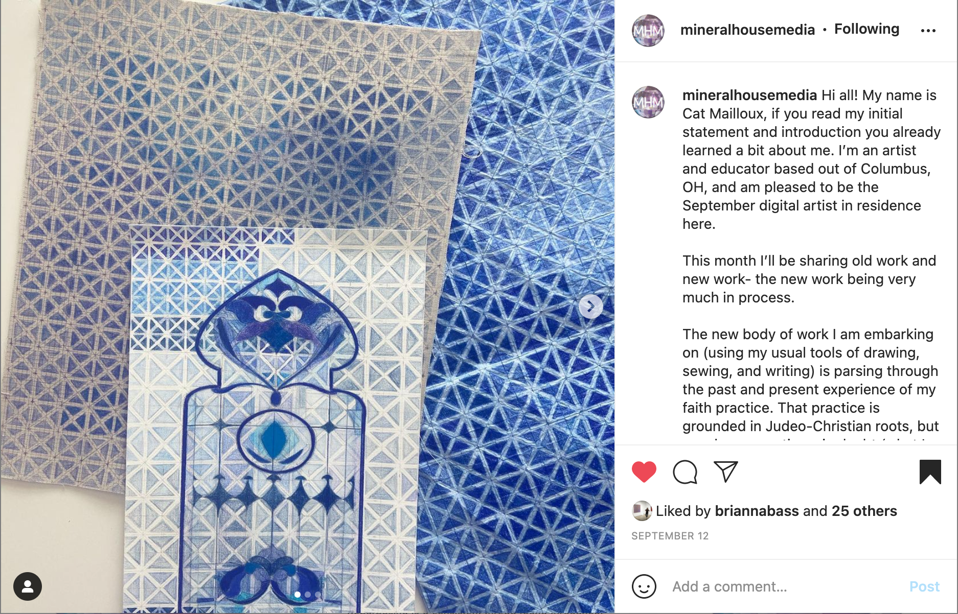
Interview with Cat Mailloux

Interview with
Cat Mailloux
September 2021 Digital Resident
A conversation with Clay Aldridge & Victoria Sauer of Mineral House Media
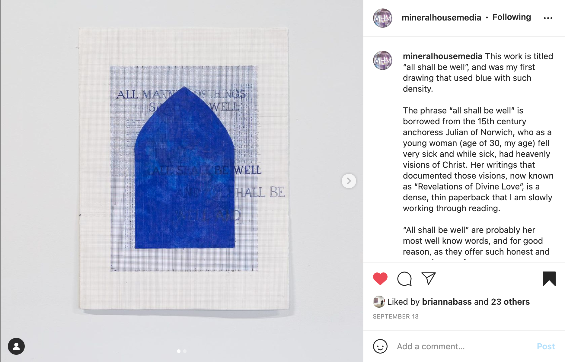
“I am drawn to processes that form a tactile memory of touch. This sense of touch translates into and across mediums of fiber, drawing and sculptural forms. Weavings, quilted and felted works mark an imminent and insistent gesture of the hand and body. Text, in short and extended narrative, take the form of hand-made books finding their place on an intimate scale, forming a one-to-one relationship with the viewer. These works probe my sense of spirituality, which is largely molded by the Christian traditions of my family history. They allow a consideration for inevitable moments of corporeality alongside the impulse and desire for immateriality.
How I handle materials —layering, folding, pressing, creasing, embedding— impresses sets of conditions that connect a physical body to a physical material. All the while, there is a question of how one might transcend materiality, and how a considered act of touch might serve as the vehicle of such a transformation.”
-Cat Mailloux
Mineral House Media: Your art practice appears closely connected to your faith experience. How do you approach spirituality and religion in your work?
Cat Mailloux: I find religion to be an expression of our questions. The language, liturgy, and practices of the Christian church was the backdrop of my childhood. I consider Christianity to be my mother-tongue, my lens. Naturally, it bleeds into my work, and I am allowing it to bleed more and more.
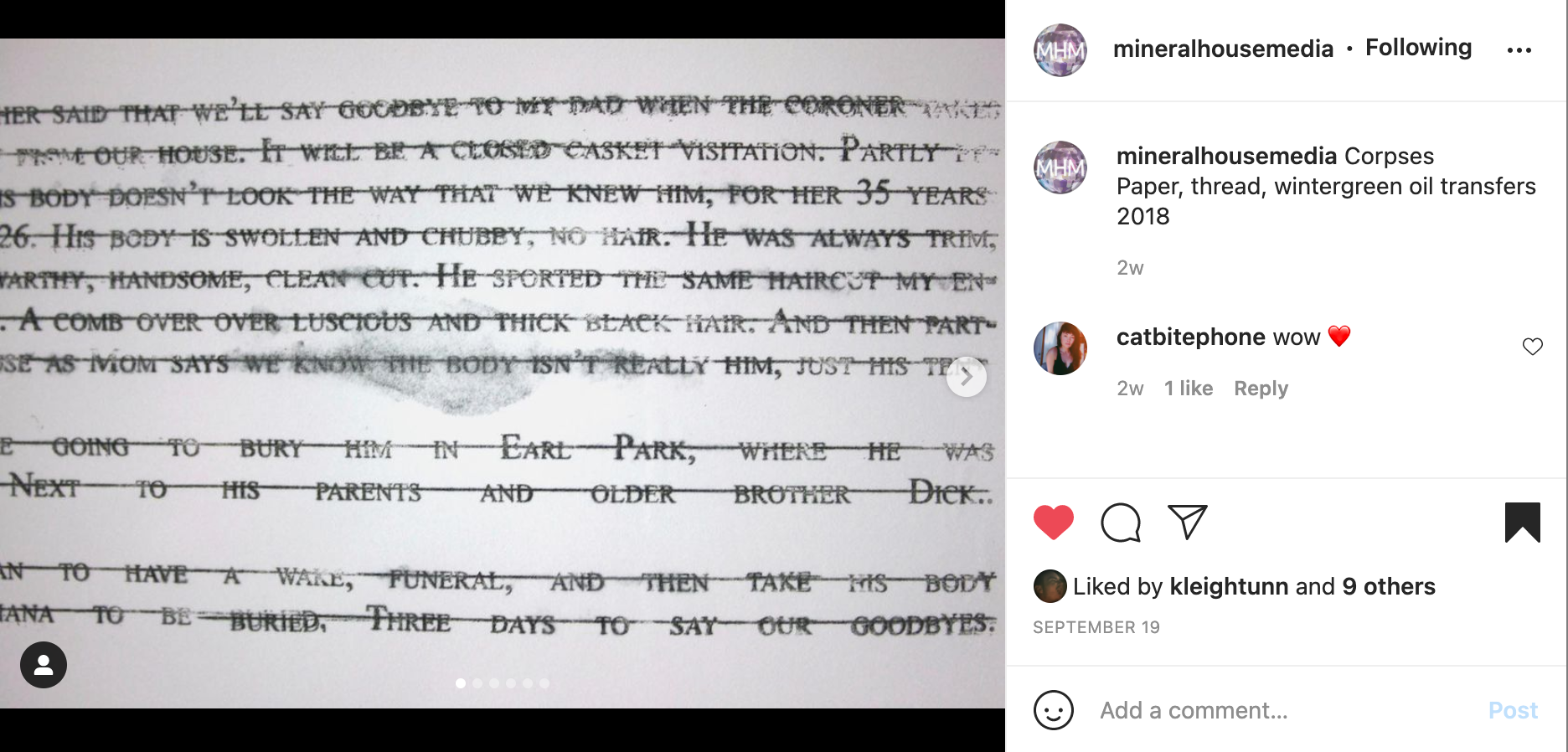
I approach this context like a personal history, while realizing that I am a small person, operating out of a small mind, in a very large, infinite world. The traditions and theology within Christianity center a belief in resurrection of the dead (and consequently, and forthcoming, a new heaven and a new earth). The death of my father several years ago brought this theology into glaring light.
Scripture has a startling ability, and insistence, on holding life and death together, giving them equal value in how they are embodied—to the full. I am interested in that tension, that paradox and reversal of language, that is repeated throughout scripture, that confusing sentence, “what is mortal may be swallowed up by life”.
In my work, I try to hold both things, my own corporeality, and the mystery of being able to be met with resurrection (not just in the sense of a life-after, but a move towards renewal and restoration in the present). Both are good.

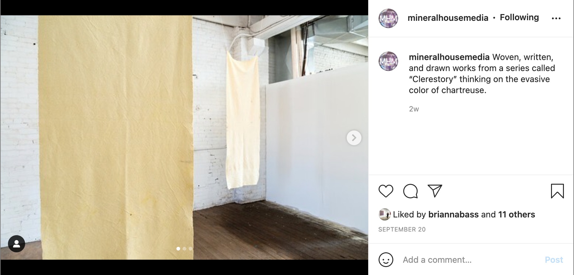
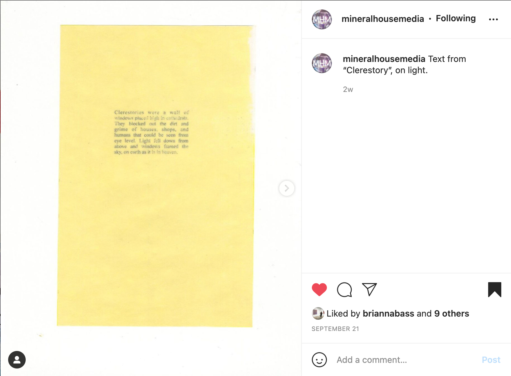
Clerestory, 2020, Mixed Media, Installation view
“[Colored pencils] are unassuming and don’t try to be anything they’re not.”
MHM: What is it about colored pencils that really clicks for you and your work?
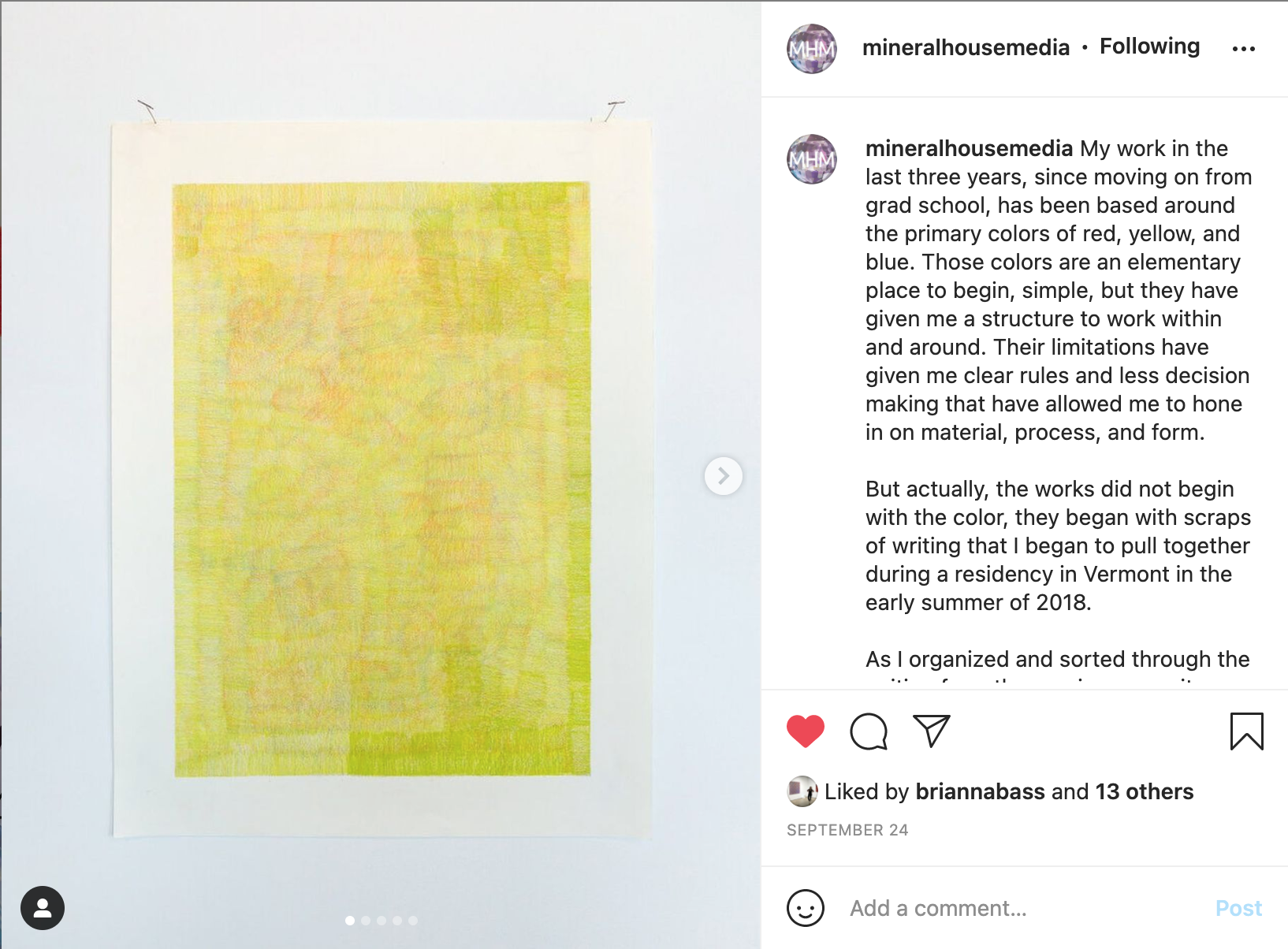
CM: It’s their humility. I used colored pencils often when I was a kid. They feel comfortable in my hand, they are easy to find, easy to sharpen. They are unassuming and don’t try to be anything they’re not. They embody the honesty that I want to have in my work, in my life, in my practice. They’re straightforward.
I have a good friend who often works in bold colored pencil to make beautiful, vibrant drawings. He made fun of my colored pencils because I often work from a cheap pack that I used in high school. I have to work in layers and layers to get the colors I want. But in that, they lend a transparency that reveals an interiority and history.
I’ve leaned further into colored pencil lately (in the last three years) because they can layer and eventually build into something. I have also started using a nicer grade of colored pencil.

Transparencies, 2020, Hand-made book, 14” x 8”
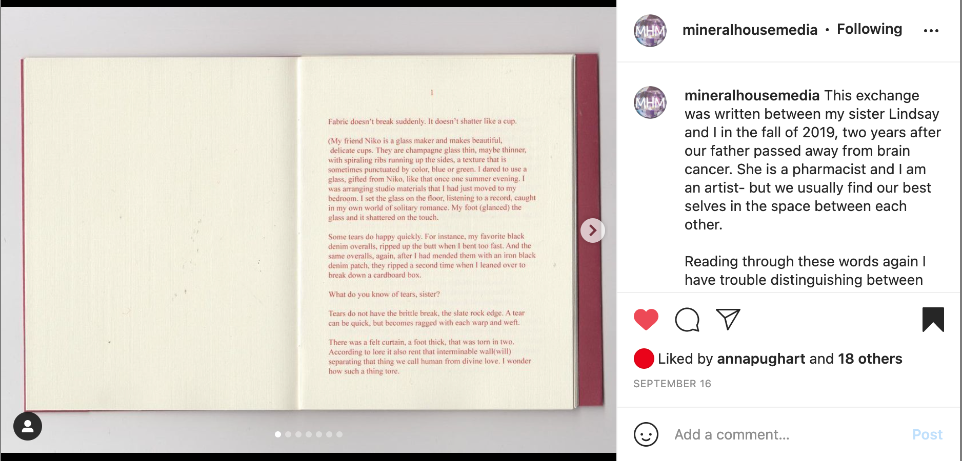
MHM: Can you speak about the role of text in your work? How much do you like to give? How much do you like to hold back?
CM: I like to push and pull. Over time, text has taken a lot of different forms in my work. It took a long, narrative form in my thesis writing. For a while, I made fabric banners that had just bare sentences and words on them. Most often I write in fragments that can build on themselves, connect to each other, and morph into new forms.
I do a lot of writing in bits as I make and more between bodies of work. I do continue to write in longer essay form, and I will give as much as the viewer is willing to take (usually, I do like some mystery and puzzlement). Sometimes they are willing to read an expanded essay in a book, sometimes they just want the shorthand. I usually show a combination of both when I show my work. Instagram is strange platform for sharing my written work because I can’t share the full of it. It is a very small screen to engage longer written work.
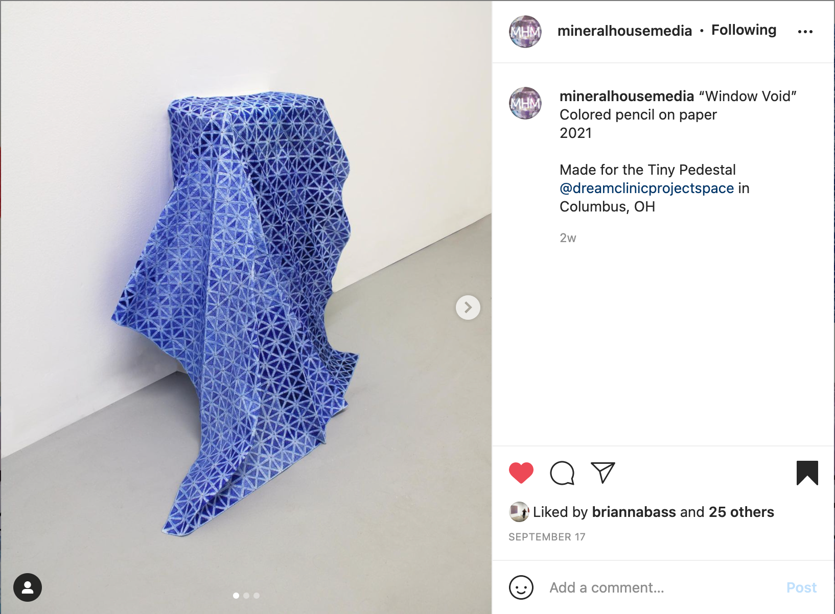
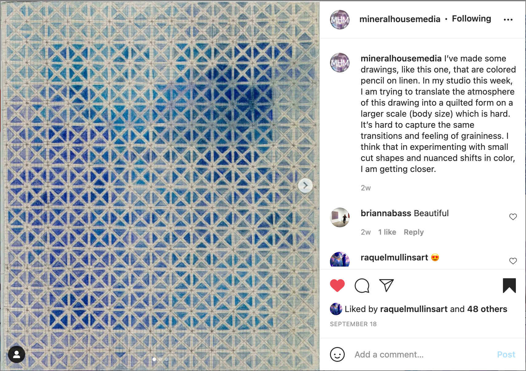
MHM: Let’s talk about materials. What paper do you use for these criss-cross drawings? “Window Void” presents such an incredible illusion of fabric, rather than the traditionally stiff and crinkled texture of everyday paper.
CM: There are a couple of different criss-cross patterned drawings. The fuzzier looking ones are colored pencil on linen fabric that I glued with iron-on adhesive to paper. Some of the drawings are on regular paper. The criss-cross pattern that folded over a form was drawn on a vellum graph paper that I crumpled up, over and over, to make it feel like fabric. I used to make marker drawings on Tyvek paper--these feel similar but don’t have the plastic quality. The crumpled-up drawings have a material quality that is somewhere between paper and fabric.
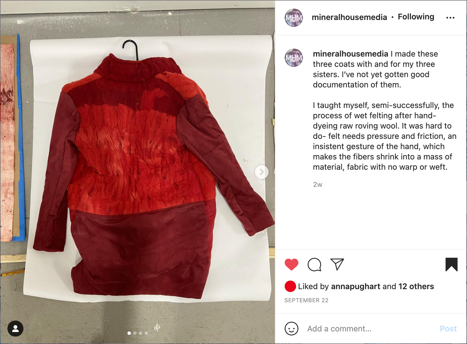
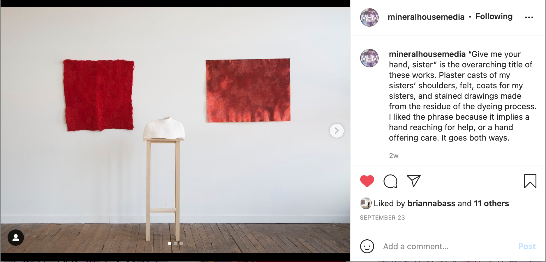
MHM: You've associated red, yellow, and blue with members of your family. How has exploring these colors affected how you feel about those relationships?

Give me your hand, sister, 2020, Mixed-media (felt, wood, plaster, madder dye on paper), Installation view
CM: I have always wanted my family to be in my work. My mom, dad, and four siblings have always been a focus of my identity. I know who I am because I know their height, the width of their shoulders, the softness or hardness of their torsos, the way their lips look when pursed, or the look in their eyes when they are determined. I am unmoored without them. Color is a succinct way to code what they mean to me (sacred, elemental), how much I love them, how much I am caught in their love. Including them in my work helps me understand them. It helps me navigate tension that I have with them, and always mirrors back myself.
MHM: What’s it like having your studio in your home? How does that impact your practice?
CM: I think in my current season of life having my studio in my home has allowed for easy transitions in and out of the studio. I have an hour commute to work, and I am appreciating that once I am home there are few steps I have to take to get to my studio. It is small and has some limitations in the sense of not having white walls or the option of a messy floor, but right now it is offering what I need. The space also limits what materials I can keep which brings me focus.
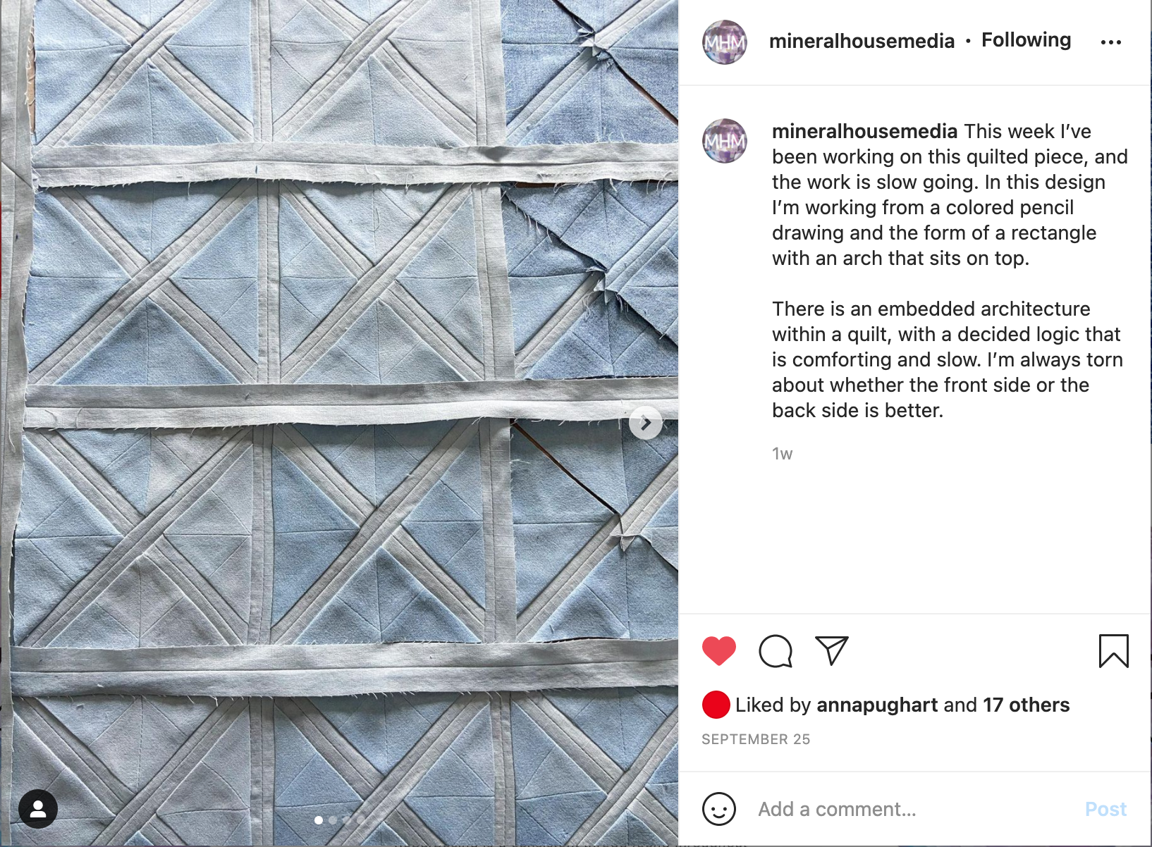
MHM: In regards to your new work, what is your relationship with the blue pencil drawings on paper? Do you feel connected to them as finished works in their own right, or do you view them as strictly preliminary outlines for the quilts to come?
CM: I view them as important. It helps when I have friends look at them. I described them recently as being “made in the margins” of my life, because they are made during little scraps of time in the evenings and weekends. They have rough edges and do feel more like sketches, and I am not always satisfied with them. I am using them to practice iterations-- try things one way, adjust the bandwidth of a certain quality in one, a different one in another. I’ll keep making them and see how I feel about this question in several months. They do seem to hold the material qualities that I am after: fragility, honesty, hand-made, assurance. But I’m still planning to make quilts because I want to see what they will do.

Window Void, 2021, Colored pencil on paper, 24” x 24” x 17.5”
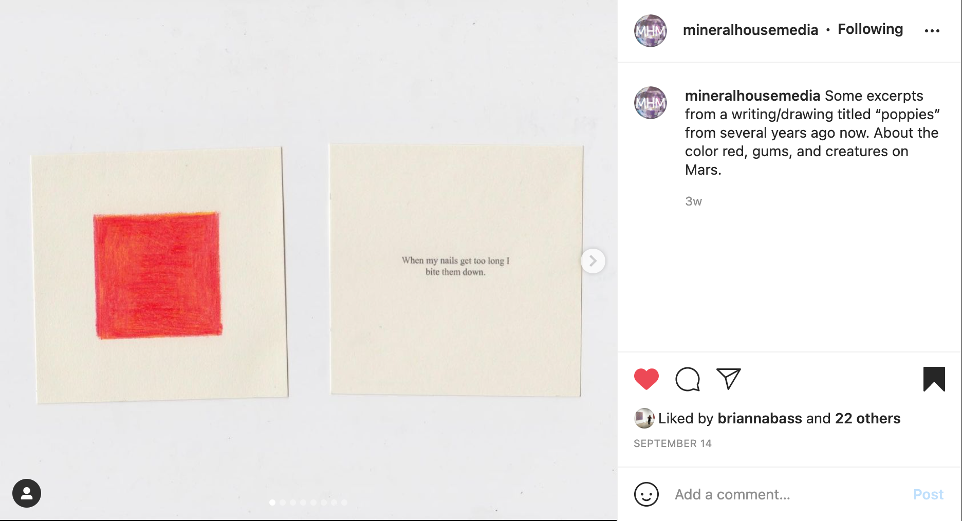
MHM: Seeing that you have also channeled your work into the medium of book making, what type of viewing experiences differ between your books and works on paper? I’m specifically reflecting on “Poppies” and the intriguing choice of placing text next to a corresponding drawing and how that differs from the framework of a page-bound book.
CM: That piece is interesting to me too. The pieces can be arranged in any order and read in any order. They don’t need a chronology to organize them. In this piece, you read about the color red, and then see the color red, or something close to it. The loose arrangement also offers the possibility of more being added or some being taken away. In that sense it relates to how memory works as a store of images and stories that is always expanding and shrinking.
The repetition of the color alternating between text is like a teacher going through flashcards with you. Gives you the problem, shows you the answer, again and again, so that the next time you see it you don’t have to think about it, you just say the answer. The pieces are like Pavlov’s classical conditioning; I’m trying to burn my memory onto your brain.
“To pay attention is to love.”
MHM: Pace is a key component in your work. Is it important to you to do certain things slowly?
CM: Yes. I fall into the trap that if something doesn’t take a long time to make, it’s not good. I’m not sure where that mentality lives or comes from within me. The first kind of concentrated art making I ever did was making quilts, that I started doing when I was ten. It’s all about repetition, first with cutting, then with sewing, the same lines and shapes, over and over. I think repetition is my habit when I sit down to work.
But I also have a core value attached to time- that to pay attention is to love. Mike Kelley made a piece whose title contains the phrase “Love Hours”. Those words have impacted and given language to the way I make work. To spend time is to give value, to spend time is to love—that act of making is a gift and a privilege.
I also am trying to work slow because I don’t want to make too much. I’ve thrown too much artwork away.
MHM: Any book recommendations?
CM: These are the books that I feel have most shaped my practice lately:

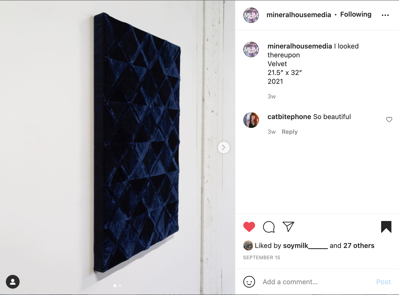
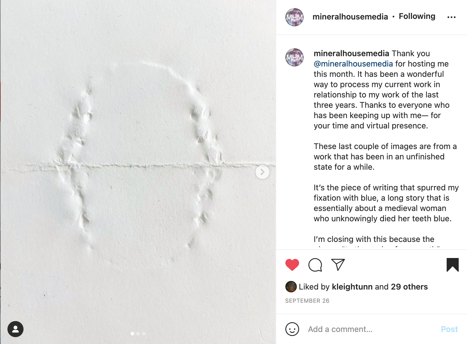
Finished quilt made during the MHM digital residency, 2021.
Surprised by Hope by N.T. Wright, The Universal Christ by Richard Rohr, Womanist Midrash by Dr. Wil Gafney, Cutting for Stone by Abraham Verghese, Final Exam: A Surgeon’s Reflections on Mortality by Pauline Chen, Emotional Agility by Susan David, Art and Faith by Mako Fujimura
MHM: With your self-imposed parameters of the use of primary colors, what’s in store next when you finish out your blue work?
CM: That’s a good question. Mentally right now, as I think past these blue works, I have an idea for a project that will work using only white, and I am thinking it will act like a palette cleanser. And then go from there. I’ve found these primary colors very fruitful and helpful though, so I might continue to return to them. I’ve also been thinking more about stained glass, and wonder if I could handle more color in the quilted pieces in the way that they exist in stained glass windows. I’m a little wary of a lot of color. As it says in the gospel of Luke, “to whom much is given, much will be required,” and I only want to jump into more complex color when I am ready for it. I’ve also been thinking about Ann Hamilton’s piece, Mattering, from 1998, which has a brilliant, diffused orange fabric ceiling that bathes the gallery space in orange light. But I don’t have a real reason for using that color.
Cat Mailloux (she/hers) is an interdisciplinary artist, educator and writer based in Columbus, Ohio. In 2018 she earned her MFA in Sculpture from The Ohio State University in 2018. Currently she serves as Assistant Professor of Sculpture and Ceramics at Cedarville University in Cedarville, OH. Her work has been shown throughout the United States including COOP Gallery (Nashville, TN), Janet Carson Gallery (Eau Claire, WI) and Roy G. Biv Gallery (Columbus, OH). In 2019 she was a Writer in-Residence at Vermont Studio Center (Johnson, VT) and an artist fellow at the Columbus Printed Arts Center (Columbus, OH). Her visual practice extends into community work as a teaching artist, partnering with a neighborhood recreation center (Milo-Grogan, Columbus) to teach sewing classes for children and adults.